Learn what a brand identity includes, what to request from your designer, how to test the guidelines and how to use AI for branded materials.
When a company commissions a brand identity or updates its existing one, it helps to agree which materials the business will produce and what it needs from the designer. Packaging for a product range, a website and a presentation do different jobs. Discuss the deliverables using the formats your business will actually use.
Examples from our projects show how the same elements work across formats and which decisions belong in the guidelines so employees and suppliers can apply them. The same materials are useful if you use AI for part of the production process: they give the tool a reference and help you assess its output before publication. Project artwork below is shown in its original language; it illustrates the design decisions rather than a new identity for the UAE market.
What a brand identity is and what it does
A brand identity consists of a company's visual elements and the principles for using them together. A familiar logo helps people recognise the company; colour, typography and graphics reinforce that connection when the logo occupies little space. Products from the same brand might use different colours or images on a shelf while repeating the name's placement, the shape of a label or a graphic motif.
This matters when a business has several products. Customers need to recognise the range and distinguish the option they want. If every pack follows different rules, the range is harder to recognise as a whole. If all the labels look identical, it becomes harder to choose a particular product. During development, compare several products side by side and decide which elements connect them and which change with the product.
The elements of a brand identity
The core elements are a logo, a colour palette and typography. Depending on the brief, the system may also include graphic elements, photography and layout rules, and templates. Here is how each element helps someone make a decision when preparing a design.
The logo and its variants
A full wordmark may work well in a website header but become illegible as a profile image or on a small sticker. A compact version can help if the identity includes one. Dark backgrounds may require a light version. Show the variants at realistic sizes and on relevant backgrounds in the guidelines so the person preparing a layout can choose the right supplied file.
For Minisklad, a storage business, we created separate marks for its service lines. Their shapes derive from the main logo, while colour helps distinguish the services. This approach can help a business identify several services while retaining their connection to the parent brand.
Brand colours
A palette becomes useful when each colour has a clear role. Backgrounds, text and accents need different combinations. If an accent highlights a discount on a banner but distinguishes a flavour or size on a product card, show those uses separately. For print, check a proof; for screens, check fine details and text contrast on the chosen background.
For cosmetics brand OSNOVA, grey and beige provide a neutral base, while green, sky blue and purple distinguish products and create emphasis. The palette connects the range while helping people navigate it. Explore the OSNOVA case study.
Typography
Typography guides how people read information. On a presentation slide, they might notice the main conclusion first, then read the explanation and chart caption. On a product card, they need to find the name, variant and key specifications quickly. Examples of these levels make the brand typeface usable in both formats. Check that the team can access the font in its editor and that it supports the characters required for the work, including both scripts if you produce English and Arabic materials.
Graphics, photography and layout
Patterns, illustrations and the character of the photography give an identity more flexibility. Explain the principles through materials the business produces regularly. For a catalogue, specify the camera angle and distance from the subject. For banners, show where to leave room for a headline. If one photograph needs to work as a wide cover and a vertical ad, check both crops before the shoot.
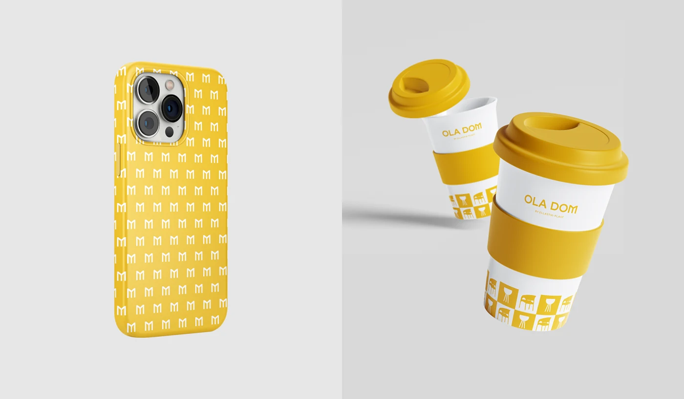
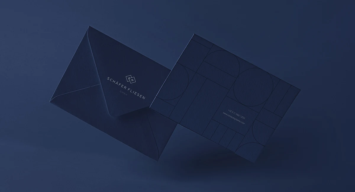
Ola Dom graphics. A letter-based motif repeats on the phone case; the same yellow-and-white palette and the Ola Dom name connect the cups to the brand. Ola Dom on Behance.Schaefer Fliesen stationery. Tile geometry becomes a background pattern on the business card, while the envelope retains the logo and dark blue. Schaefer Fliesen on Behance.
For Sytnye Ugodya, a food brand with a broad product range, we used brand colours, a pattern and photographs of prepared dishes on the labels. The partner website and marketplace materials followed the same visual system, although they served different needs. A business partner needed to understand the range and terms of cooperation; a marketplace customer needed to understand a particular product. Compare materials serving different purposes and check what connects them to the brand despite the different amounts of information.
Choose the right identity deliverables for your business
The scope depends on your business needs and the formats you use. For a service business, start with the company website, proposals and presentations. For a manufacturer, test several products on packaging and marketplace cards. A printer needs production-ready files; a salesperson needs slides with prices and terms they can update.
Visual identity guidelines explain how to apply the identity. A brand book may also cover positioning, values and communication principles. Suppliers use these names differently, so agree on the contents rather than relying on the document title. For daily work, the team needs accessible source files, guidance with examples and editable templates for recurring materials. Brand strategy defines positioning and communication principles; the visual guidelines show how to apply the identity.
What to include in the guidelines and request from your designer
Visual identity guidelines explain when to choose each logo variant, combine colours, format text and select photographs. To check whether the document will work for your team, ask the designer to demonstrate the rules on several formats you produce regularly.
Rules with examples for your formats
Ask to see logo variants on different backgrounds, colour roles, text hierarchy and principles for using photography and graphics. Choose two or three formats from your next tasks. For new packaging, compare labels for two products in the same range. For recurring banners, include wide and vertical versions to see how layout and cropping change.
Source files and templates the team can use
Request approved logo files for screens and print, colour specifications, a font list with access or licensing information, graphic elements and editable templates for recurring materials. Check that your team can open them in its editor and change a headline, price or photograph independently.
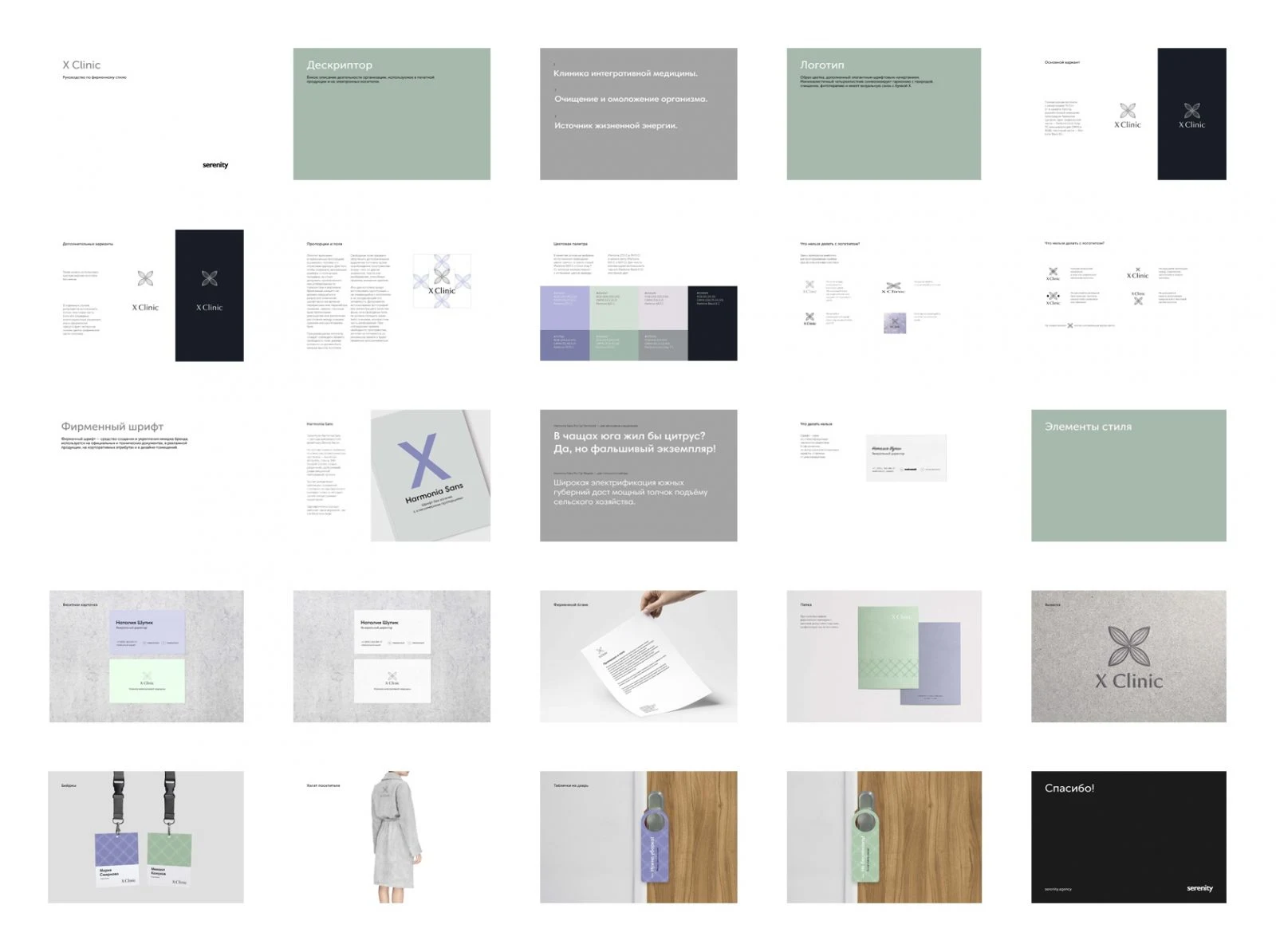
Original Russian-language X Clinic guidelines. The pages cover the descriptor, logo variants, clear space and proportions, palette, typeface, graphic elements and example applications. The artwork is retained as a project example.
Test the guidelines before acceptance
Agree in advance which materials you will use to test the guidelines. In the handover meeting, ask the designer and the person who will use the files to work through a task together. For a new product card, that person should be able to find a template, select a suitable image and place the product name. If the next step requires an explanation that is missing from the document, ask for an example or a clearer rule before accepting the files.
Guidelines for Bez Ramok franchisees
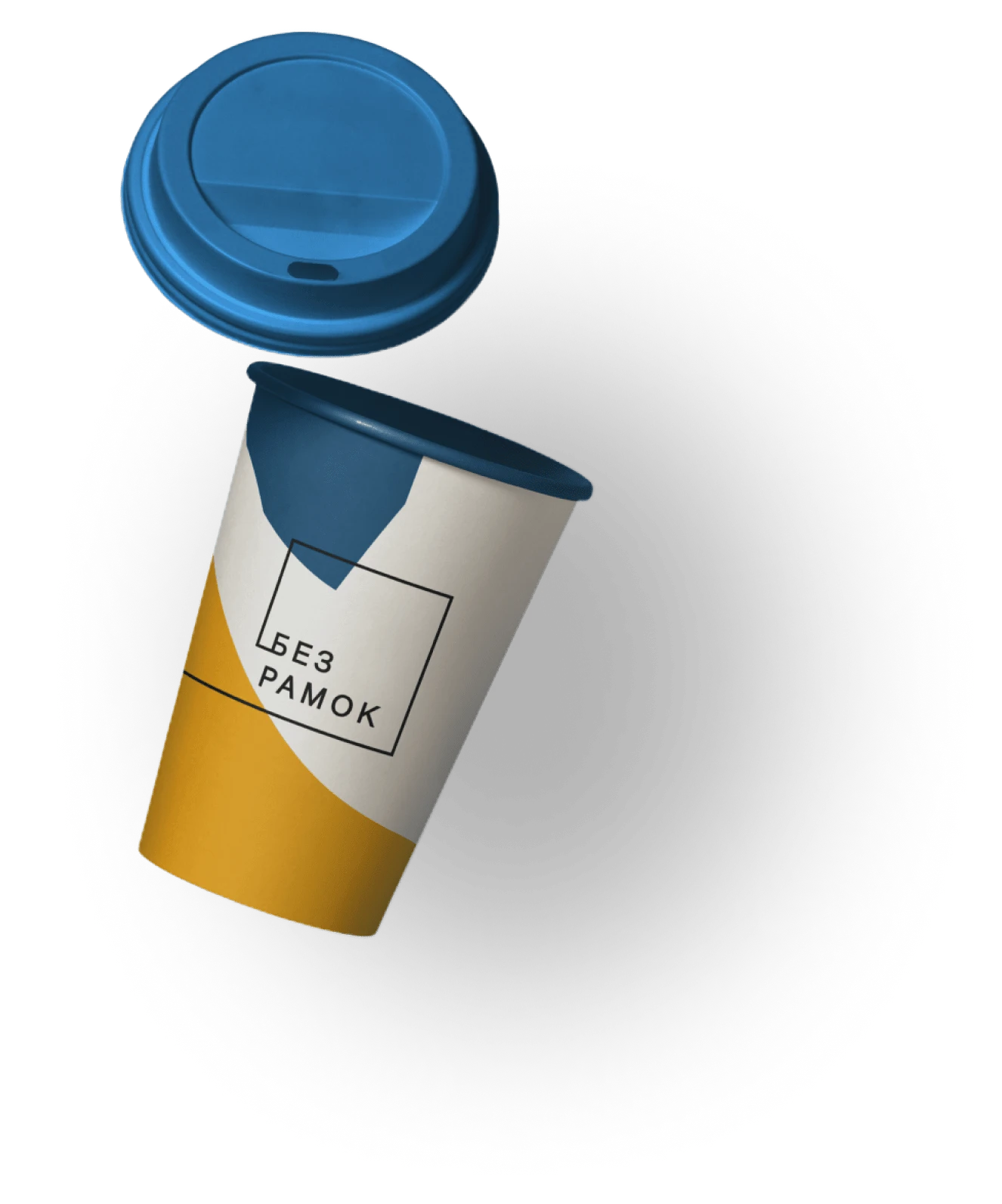
For the Bez Ramok art centre, we assembled guidelines for future franchisees using materials the team already had. They showed how to use the logo, colours and fonts on cups, bags, aprons and social media. Franchisees could pass the document to their designers and suppliers. For a similar project, discuss the deliverables through each supplier's first task: a printer producing bags needs to know which file to use and how to position the mark.
An application from the Bez Ramok project. The cup retains the original Cyrillic brand name, meaning “Without Frames”.
Try the identity on a real piece of work
Ask the future user to make one real layout using the supplied files, guidelines and templates. Give them an actual headline, photograph and offer terms for a banner. Review which files they could find, which decisions the guidelines helped them make and where they had to ask the designer.
If a light logo variant is missing, make the approved file available. If photographs in a series look inconsistent, add visual examples. If the offer does not fit the template, agree on a second layout. The trial shows whether a template solves a recurring task and where it needs flexibility.
Why teams stop using guidelines and how to fix it
Guidelines fall out of use when they do not answer a new question, source files no longer match the document or templates cannot accommodate real content. Start with a piece of work where someone departed from the rules. It can show what to update first: an example, a file or the template itself.
The rules are clear until a new format is needed
A polished banner shows the finished result. It may not explain what can move, where text belongs or how to crop the photograph in a vertical version. Add two versions of the same design and explain which elements must remain consistent. The next person adapting it will have a usable reference.
Different suppliers use different files
If a printer takes a logo from an old email and a marketer downloads one from the website, different variants can appear in the materials. Keep current guidelines, source files and templates in one place. Appoint someone to update them when a new template or rule is approved. Include the link in supplier briefs.
The template only works with the sample text
A demonstration headline may fit on one line while a real product name is twice as long. Test the files with a long name and a photograph whose subject sits near the edge. If the template relies on ideal content, ask for another approved layout. It is likely to be more useful than an extra presentation mockup.
Update the guidelines around recurring questions. If every promotion requires a new discussion about the discount label's colour, add a rule and update the template. The same approved materials will help when AI handles part of the work.
Use AI to create materials that follow your brand identity
AI can help prepare an illustration, suggest layouts or adapt a design to a different format. Give the tool approved colours, examples of brand photography and a template for the required format. Before publication, compare the result with approved brand materials and check the logo, text legibility and product facts separately.
Why matching colours do not guarantee a consistent result
Consider a fictional coffee brand that needs a product card, a promotional banner and a presentation for retailers. All three use a cream background, dark type and an orange accent. But the card shows a pack on a light background, the banner uses a dark café photograph and the presentation has illustrated cups. Because the images occupy most of the space, their different styles outweigh the shared palette.
For the next series, agree on a consistent way to show the product: a large pack, a restrained background and soft side lighting. On the product card, the pack and variety name take centre stage. On the banner, leave space beside the photograph for the offer. In the presentation, combine the photograph with supply information. Each piece serves its own purpose while using a familiar way to present the product.
What to give the tool and what to keep editable
To generate an illustration, provide a reference for the intended treatment and indicate where text will go. Place the resulting image in a template with separate, editable logo, headline and price elements. The marketer can then verify the approved logo and update the offer next time. If your editor supports a brand kit, store the approved logos, colours and fonts there.
Canva allows eligible users to add Brand Templates to a Brand Kit for AI-generated presentations and social media designs. Availability depends on the plan, access and permissions. Check the current Canva documentation.
Turn a successful layout into a reusable template
Try another piece with a different headline length or a new photograph. If the headline only fits after a large reduction in font size, prepare a two-line variant and check that space remains for the price. If a face or product is cut off in a vertical format, use a different crop. Save the tested variants and share them with the team. Before release, compare the new design with two approved examples and view it at the size the audience will see.
Where to start when updating your brand identity
If you already have an identity, start with a piece of work you will need soon. Identify decisions the team keeps making from scratch, then update the file, rule or template that resolves the recurring question. If you are considering a wider brand refresh, establish how much needs to change. When commissioning a new identity, bring examples of regular materials and ask to see how the proposed system works on them. This can reveal the need for another logo variant, photography guidance or a more flexible layout before handover.
If you need to develop or update your brand identity, tell us where you will use it. We can help choose the elements, test them on your materials and assemble guidelines your team can use.