Visual Identity

We create brand identities for companies that visually express the essence of their product,
build memorable associations and are easy to recognise.

A brand's visual identity is a clear, memorable system that helps an organisation earn trust and build customer loyalty.

We help a brand stand out from the advertising noise and strengthen its image. Logos, colours, typefaces, mascots and other graphic elements work together to express a consistent tone. We create visual and verbal cues that evoke emotions in line with the brand concept and platform.

  • 1

    We create a distinctive, contemporary identity for a new brand.

  • 2

    We bring brand values into focus and build an emotional connection.

  • 3

    We increase audience interest and loyalty.

Our approach

Clarity

We build visual identities around business positioning. We start by asking what customers should understand about the company at first sight, then use the product and audience expectations to guide colour, graphics and typography.

Simplicity

We make the brand's meaning easy to understand by removing distracting or confusing elements.

A structured approach

We keep your brand recognisable across websites, social media, advertising, signage and printed materials. The identity should retain its character from a small icon to a large display. We define which elements stay consistent and which can adapt to the format and message.

Make it distinctive

We find distinctive solutions that set the brand apart without relying on unnecessary comparisons. Visual and verbal cues help people identify it quickly and clearly.

Comprehension

We communicate product benefits and company philosophy, create positive associations and help audiences feel connected to the brand.

Synergy

Specialists work in sync around shared goals and strategy. This coordination makes campaign work more effective and reduces inconsistencies between teams.

Clarity

We build visual identities around business positioning. We start by asking what customers should understand about the company at first sight, then use the product and audience expectations to guide colour, graphics and typography.

Make it distinctive

We find distinctive solutions that set the brand apart without relying on unnecessary comparisons. Visual and verbal cues help people identify it quickly and clearly.

Simplicity

We make the brand's meaning easy to understand by removing distracting or confusing elements.

Comprehension

We communicate product benefits and company philosophy, create positive associations and help audiences feel connected to the brand.

A structured approach

We keep your brand recognisable across websites, social media, advertising, signage and printed materials. The identity should retain its character from a small icon to a large display. We define which elements stay consistent and which can adapt to the format and message.

Synergy

Specialists work in sync around shared goals and strategy. This coordination makes campaign work more effective and reduces inconsistencies between teams.

Our identity development process

We brief you to understand your goals and constraints, define the task and agree on a direction. We identify the features to emphasise and ways to engage your audience.

1

Research

We study your business and audience, competitors' brands and strong design solutions in your product category.

Briefing

We study your positioning, strengths and advantages, then turn those findings into a visual concept that conveys them to your audience. We ask which materials your team uses most and where design causes friction, so the identity works in everyday practice.

Trend research

We review leading local and international work in your sector and study market trends.

Target Audience Analysis

We define audience segments and what they have in common. We identify the most important touchpoints with your company, then choose a direction for the visual identity and its key communication channels.

Competitors

We review competitors' identities, assess their strengths and weaknesses and gather references to find a distinctive direction. AI helps organise large sets of materials. Our designers review the visual context, validate observations and choose the direction.

Briefing

We study your positioning, strengths and advantages, then turn those findings into a visual concept that conveys them to your audience. We ask which materials your team uses most and where design causes friction, so the identity works in everyday practice.

Trend research

We review leading local and international work in your sector and study market trends.

Target Audience Analysis

We define audience segments and what they have in common. We identify the most important touchpoints with your company, then choose a direction for the visual identity and its key communication channels.

Competitors

We review competitors' identities, assess their strengths and weaknesses and gather references to find a distinctive direction. AI helps organise large sets of materials. Our designers review the visual context, validate observations and choose the direction.

2

Implementation

We develop a design system for all of the brand's communication channels.

Moodboard

We start with a mood board to compare our vision with yours and show how the brand should feel to your audience. Once we agree on the direction, we move on. AI helps compare descriptions and prepare ways to present ideas. Our team evaluates the concept against the brief and explains the reasoning behind each option.

Logo

The logo is the central element of the identity and a starting point for the rest of the system. We develop three logo concepts and show how they could be used. Together, we select and refine the best fit.

Brand identity

We build a visual system with supporting elements, typography and colour, then apply it to the channels your business uses. We consider how headlines work with photographs, how graphics support the message and how to distinguish one material from another. The visual system turns the broader brand strategy into practical design rules.

Moodboard

We start with a mood board to compare our vision with yours and show how the brand should feel to your audience. Once we agree on the direction, we move on. AI helps compare descriptions and prepare ways to present ideas. Our team evaluates the concept against the brief and explains the reasoning behind each option.

Logo

The logo is the central element of the identity and a starting point for the rest of the system. We develop three logo concepts and show how they could be used. Together, we select and refine the best fit.

Brand identity

We build a visual system with supporting elements, typography and colour, then apply it to the channels your business uses. We consider how headlines work with photographs, how graphics support the message and how to distinguish one material from another. The visual system turns the broader brand strategy into practical design rules.

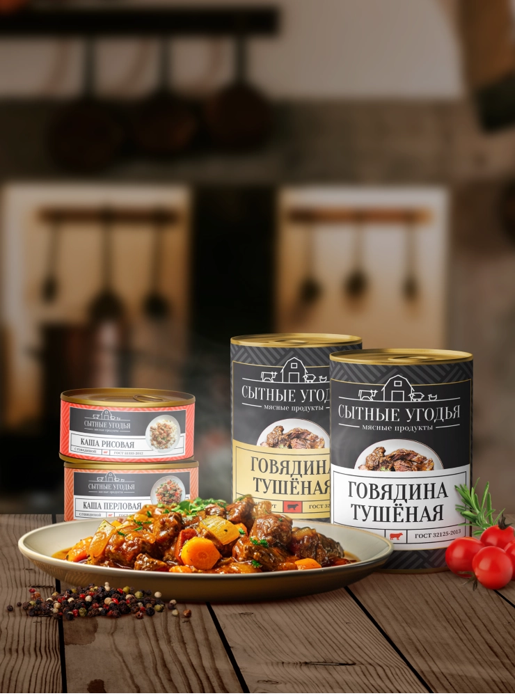
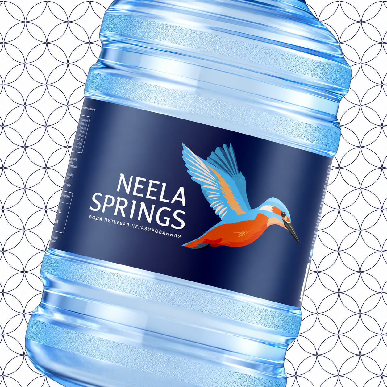
Meat producer Sytnye Ugody needed an identity that worked across packaging, its website and social media. Neela Springs had a different challenge: refresh an established water supplier's image while preserving a sense of trust. In both projects, one visual language connected the brand's touchpoints.

Sytnye Ugodya

A new visual identity for a meat producer

The producer wanted to present its products as one range. We chose a palette, created a logo and symbol, then applied the system to every product label. The same visual language carried through to the new website and social media, helping customers recognise the brand on packaging and online.

Packaging introduces shoppers to the product on the shelf, while the website and social media let them learn more about the producer. A consistent palette, logo and symbol connect those touchpoints. The Sytnye Ugodya identity therefore covered both the product range and the brand's digital presence.

A unified identity for the product range, new website and social media

View Case Study
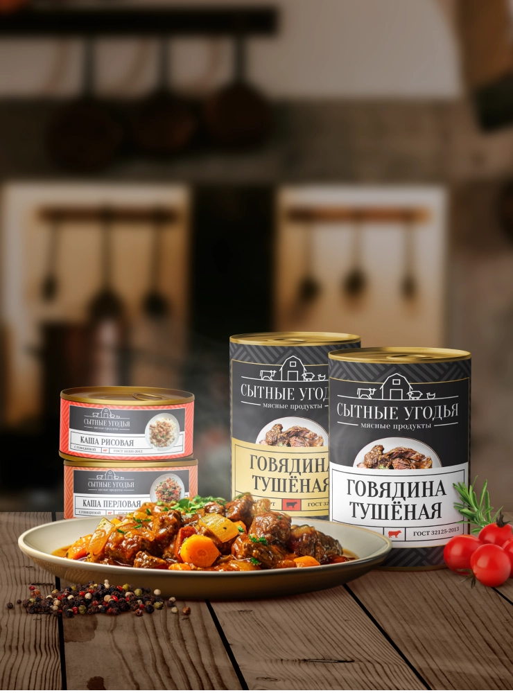
Packaging for Sytnye Ugody products

Neela Springs

Identity for a drinking-water producer delivering in Moscow and St Petersburg

The brand was already familiar to customers, so the task was to retain its sense of trust and scale while giving it more character. We chose a kingfisher as the central image, creating a distinctive motif that could extend across different materials.

The identity needed to combine the reliability customers knew with a more expressive look. The kingfisher became the central metaphor, giving the visual system a story and its individual elements a shared purpose.

The bird motif connected the brand's values with its new visual identity.

Neela Springs identity concept featuring a kingfisher
3

Channel design and guidelines

We align the visual design and functionality of every channel where your brand meets its audience.

Design

We give communication channels a consistent visual identity. The materials depend on where people encounter your company. Packaging matters for a manufacturer, while presentations and digital channels may matter more for a service business. Customers should recognise the brand as they move between channels.

Brand guidelines

We create a guide to colours, typefaces, logos and graphics so your brand stays consistent across touchpoints. AI helps organise explanations and compare wording. Designers check the instructions against the visual system and examples and decide how each element should be used.

Templates

We provide templates for banners, business cards, emails and presentations. They show both the layout and what can change, such as headline length, image placement and accent colour, so teams can produce new materials without making the same decisions each time.

Design

We give communication channels a consistent visual identity. The materials depend on where people encounter your company. Packaging matters for a manufacturer, while presentations and digital channels may matter more for a service business. Customers should recognise the brand as they move between channels.

Brand guidelines

We create a guide to colours, typefaces, logos and graphics so your brand stays consistent across touchpoints. AI helps organise explanations and compare wording. Designers check the instructions against the visual system and examples and decide how each element should be used.

Templates

We provide templates for banners, business cards, emails and presentations. They show both the layout and what can change, such as headline length, image placement and accent colour, so teams can produce new materials without making the same decisions each time.

Outcome

We create a cohesive visual identity that can be applied to the digital, printed and other materials your brand needs.

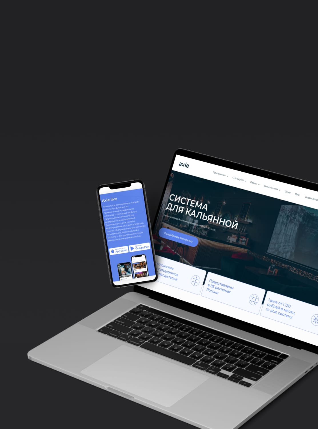
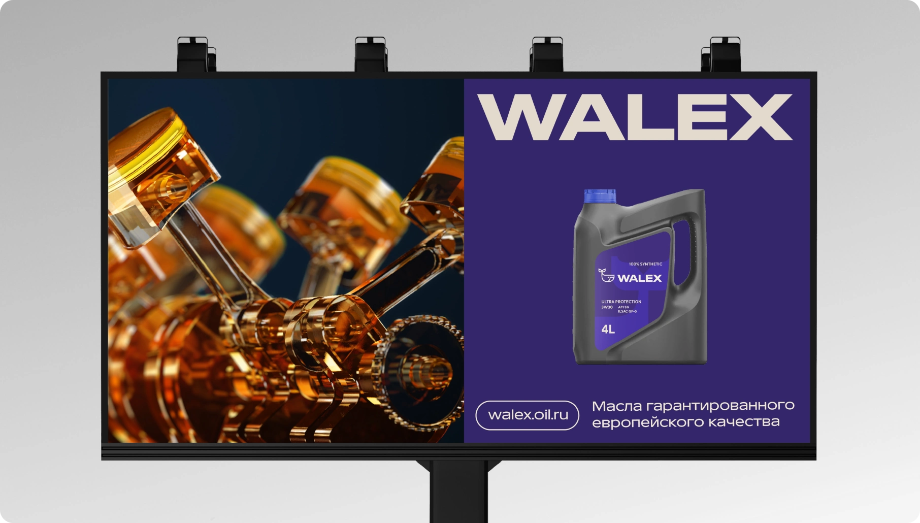
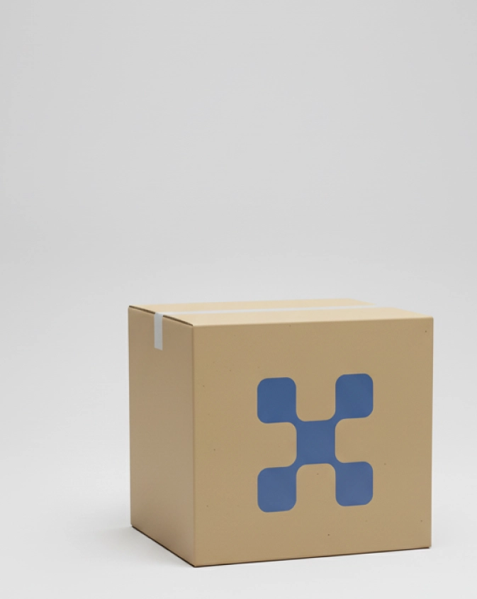
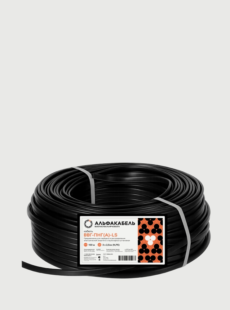
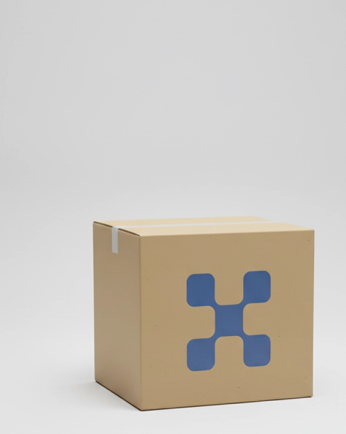
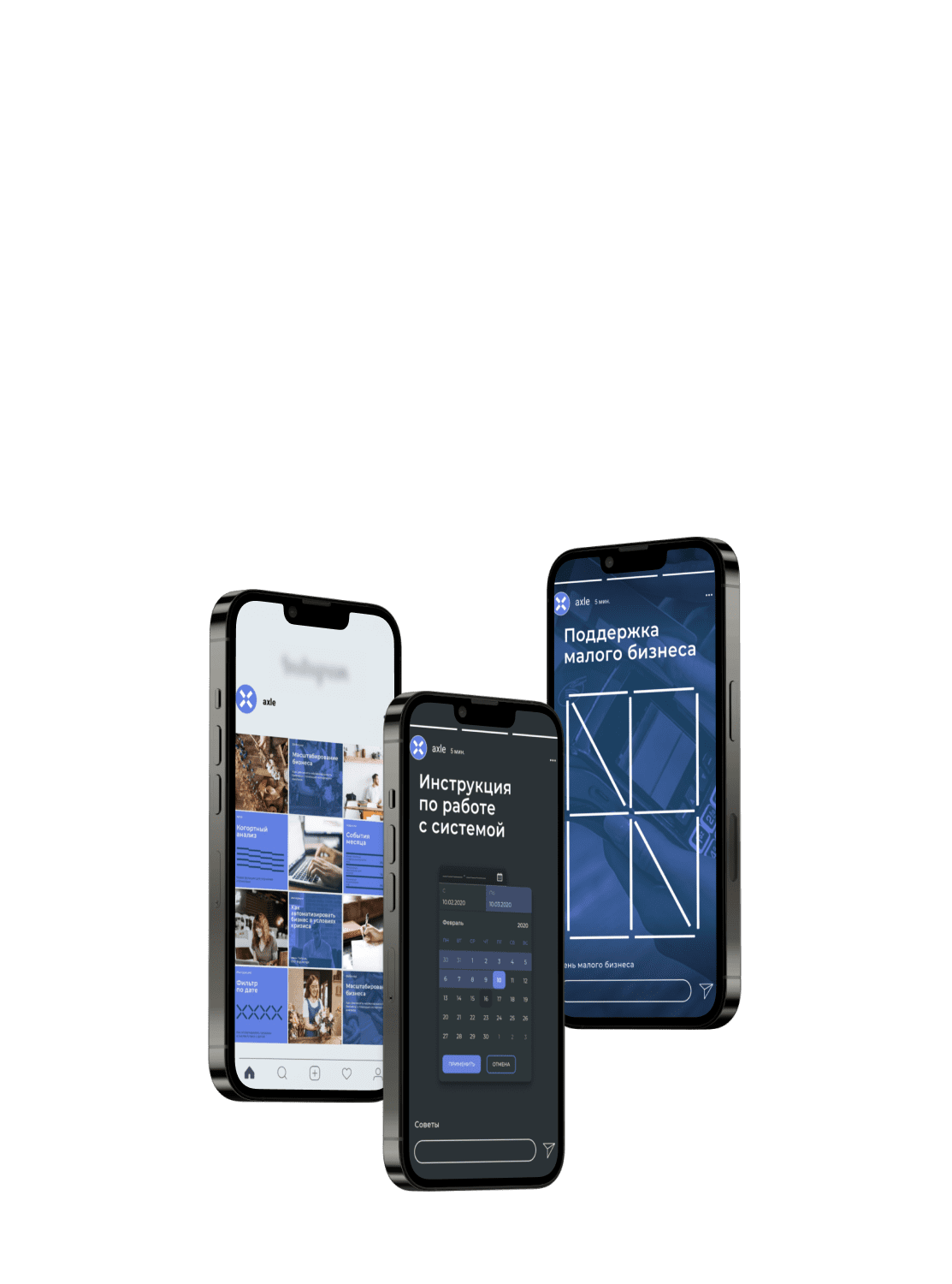
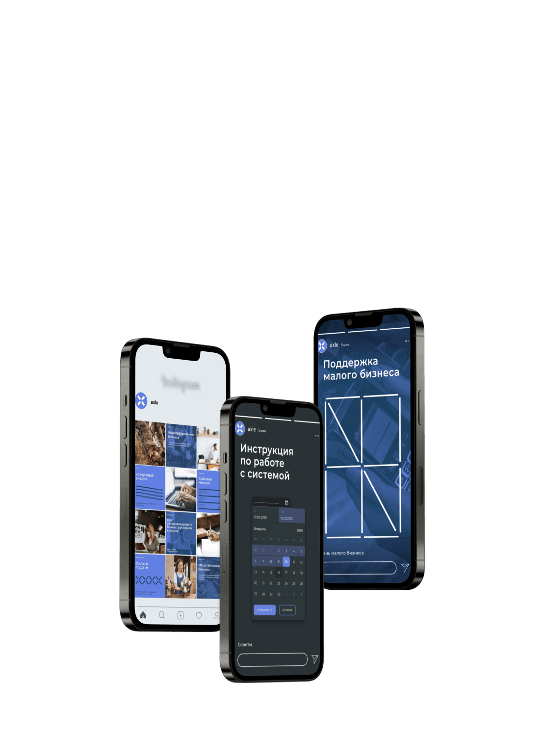
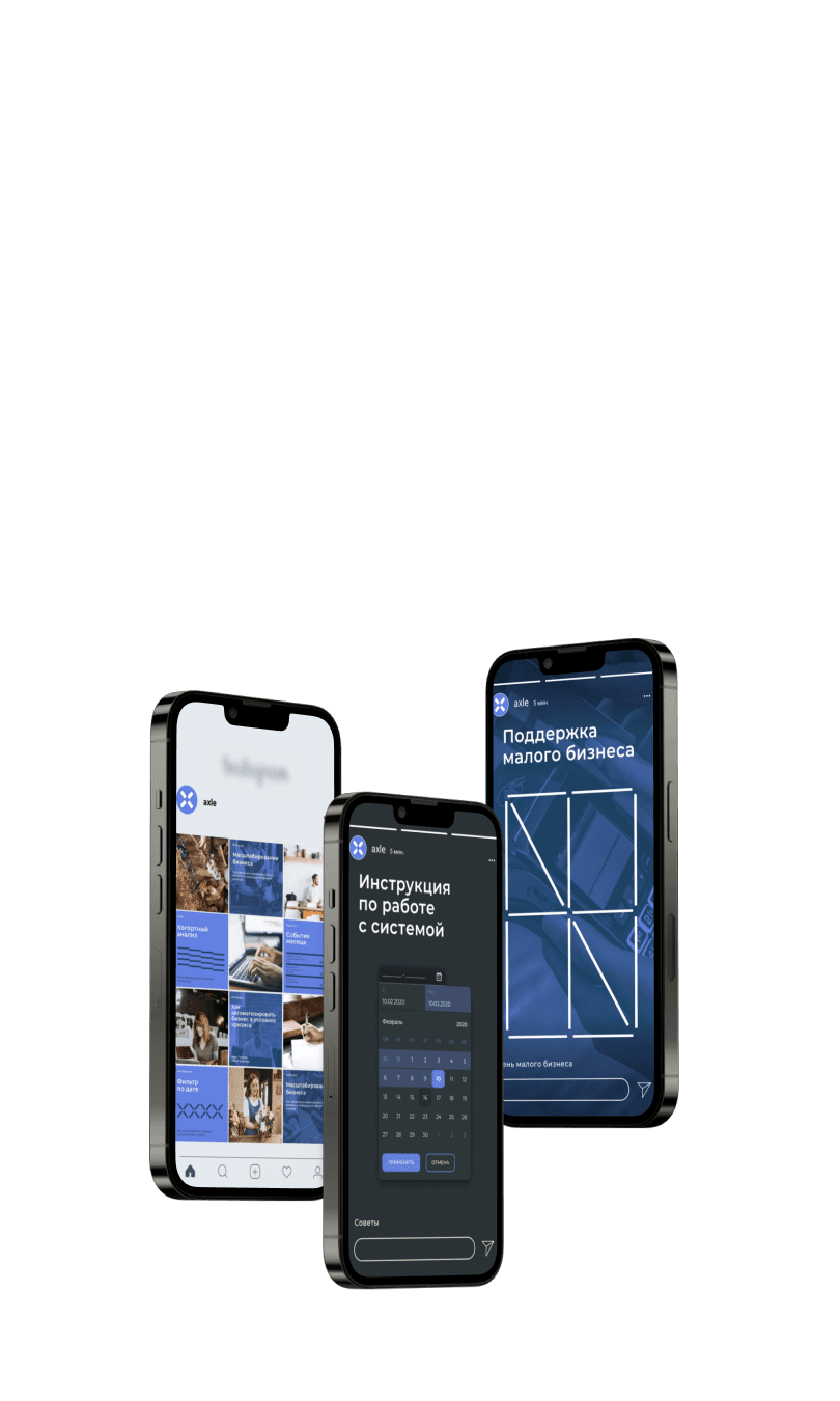
For AXLE, we expressed the idea of a system that brings order to processes through a grid and graphic pattern. For Walex, we built on the name and whale imagery to connect a range of automotive and industrial oils. Distinctive symbols give each brand a recognisable character across different materials.

Axle

Identity for a business-process optimisation software developer

The visual language grew from the idea of a system that brings order to chaos. We translated it into a grid-based pattern that shows how the product works through form, not just explanatory copy.

An ERP brand needs to explain a complex product and its role in a business. For Axle, a grid conveyed the idea of order and echoed the product's role in streamlining processes.

A visual system for a complex technology brand

View Case Study

Visual identity for technology brand AXLE

Walex

Identity for an automotive and industrial oil manufacturer

The name Walex refers to the three whales that, in mythology, support the world. We carried this metaphor into the identity and packaging for automotive and industrial oils. The image connects different products in the range and helps customers recognise the brand across materials.

The idea of support fits a lubricant brand customers rely on to keep equipment running. For Walex, the name, visuals and packaging carry that idea through. The identity ties the automotive and industrial ranges together while giving each a distinct place in the portfolio.

The whale became a recognisable element of Walex's visual identity.

Walex automotive oil container

The advantages of working with us

We immerse ourselves in your business to create more than a logo or colour palette. Every element reflects your values, audience and market. We work closely with you, agreeing on each decision together. A collaborative process and a distinctive result.

Team

We coordinate a multidisciplinary team so specialists build on one another's work. This streamlines the process and keeps the sequence of tasks clear, allowing time for feedback and revisions.

Art Director

Art Director

Leads a creative team of designers, illustrators and 3D specialists, ensuring the idea is brought to life as one coherent visual system.

Creative designer

Creative designer

Develops concepts and creative solutions for projects, turning ideas into original design directions.

Graphic Designer

Graphic Designer

Brings ideas to life in static formats, creating logos, illustrations, brochures, posters, packaging and other graphic assets.

Digital designer

Digital designer

Designs for digital channels and online experiences, including websites, apps, banners and product interfaces.

Leader

Leader

Contributes to strategy, recommends suitable tools and coordinates the specialists and art director.

Project manager

Project manager

Coordinates all specialists and participates in creative meetings, strategy development and reporting.

Account Manager

Account Manager

Represents the client's interests in the project, manages communication between the client and team, and monitors work quality and deadlines.

Our Clients

MTS logoHSE University logoGazprom logoTECHNONICOL logoVolvo Penta logoVK logoMiratorg logoOrange Business Services logoAlfa logoSever logoEtalon Group logoGroop logo

Client Testimonials

Gamayun / Sytnye Ugodya Meat Company Evgenia Rzhevskaya, Head of Retail
Open Testimonial

Serenity's team did a tremendous amount of work creating our brand and bringing it to market. They work quickly and to a high standard, enabling us to implement new ideas promptly.

We are especially grateful to the designers: every project is delivered with impeccable taste and a high level of professionalism.

We thank Gleb Borovikov and the entire Serenity team for their excellent work developing our marketing strategy and visual identity.

We received several logo options and an identity reflecting our company's business in the context of the German market.

We thank Serenity, and especially Gleb Borovikov, for our collaboration in digital marketing. Throughout our partnership, we have always received high-quality service and extremely fast delivery of the tasks set.

We thank Serenity for helping to develop and promote our brand in the IT market.

The team worked to increase sales within a very short time. We would especially like to recognise the managers, specialists, designers and marketers.

Serenity's team provides ongoing support with improving our website and attracting paid and organic traffic. They share ideas for developing our brand and implement them together with us.

The team is always in touch and responds promptly whenever difficulties arise.

We thank Serenity for helping develop digital marketing channels and paid promotion for the group's business areas.

We would particularly like to note that Serenity's specialists go beyond the contractual scope to improve results for the entire group.

Everything completed so far has been professional and high quality. Our overall experience working with Serenity's team has been very positive.

Despite the friendly communication style, the team always remained professional. We felt their sincere commitment to our product. I am confident we will continue working together.

Krasnoe Zoloto Agricultural Cooperative
Open Testimonial

We highly value your professional approach, deep understanding of our business and your team's creativity. The proposed strategy has a clear structure, a sound analytical basis and a practical focus.

We would particularly like to recognise the specialists' coordinated work, prompt problem-solving and openness to dialogue at every project stage.

Kelnik O. A. Kelnik
Open Testimonial

We thank Serenity for a vivid example of productive, inspiring and comfortable collaboration!

We would particularly like to recognise the coordinated teamwork led by project account manager Gleb Borovikov. We are happy to recommend Serenity as a professional partner.

Irbis O. V. Arshanskaya, Business Development Director
Open Testimonial

Throughout our partnership, you have demonstrated expertise and initiative in delivering the work.

The team is always ready to help solve any task and respond promptly to questions.

Client Under NDA
Open Testimonial

The team immersed themselves in the project, understood our products and market specifics, and achieved a steady flow of leads.

We particularly value the team's initiative and independence: the specialists not only deliver the assigned tasks precisely, but also suggest new marketing options, tools and approaches.

Quartier Latin Denis Dobrosmyslov, Director
Open Testimonial

We would like to recognise your employees' professionalism, reliability and diligence in completing tasks, and their willingness to accommodate our wishes.

We are satisfied with the service: all work was completed to a high standard and on time.

Marie&Me Marina Mirzoyan, Founder of the Chocolate Atelier
Open Testimonial

We thank Gleb Borovikov and Serenity's entire team for their excellent work developing a PR strategy for our atelier. The strategy defined the PR department's main areas of work, tools and stages for achieving KPIs, and an annual events plan.

SENO Space Alexander Osipov, Commercial Director
Open Testimonial

I believe it is impossible to prepare a presentation for a property in another city. Doing it quickly and well is doubly impossible. Yet you succeeded.

Because you asked many questions, studied the key sources, were not afraid of mistakes and had your own opinion.

MIPIP / M-PIX Gyulmira Dzhamaldinova, CEO of M-Piks LLC
Open Testimonial

I would like to express my immense gratitude and deep appreciation to Serenity's team for their professionalism, deep understanding of the tasks, initiative and creativity.

Fast problem-solving, timely suggestions, attention to detail and many interesting ideas are what we experienced throughout the work. With this approach, peace of mind and confidence in the result are assured.

DME Aerosol P. I. Ostapchuk, CEO
Open Testimonial

DME Aerosol thanks Serenity for helping to develop and deliver a PR campaign.

The team did extensive work preparing the strategy and implementing it across many areas simultaneously.

Client Under NDA
Open Testimonial

The team provides excellent technical support: responding instantly to requests, coordinating processes independently and providing clear reports at every stage.

Serenity took over a fragmented project, brought it into a coherent structure, solved challenging technical problems and completed an extensive redesign on schedule.

Nikolskie Ugodya
Open Testimonial

We chose Serenity for their quick responses, professional approach, customer focus and experience working with premium property developers.

The work resulted in clearly defined positioning and a brand platform fully aligned with our vision for strategic development.

Questions and Answers

What is the difference between branding and visual identity?

Visual identity is the visual part of branding: the logo, colours, typefaces and other design elements. Branding also includes strategic elements such as positioning, values, mission, audience communication and market perception.

What should I prepare before developing a visual identity?

Share a product description, audience information, positioning and examples of current materials. List what needs to stay, the formats you use most and the problems with your current design.

Why test a visual identity across different formats?

Elements can behave differently on a presentation slide, a small product card or packaging. Testing shows where legibility drops, how colours and graphics behave and whether the brand remains recognisable.

How do branding and visual identity relate?

Branding defines who the brand serves, what sets it apart and what it promises. Visual identity expresses that foundation through design and gives teams a consistent way to communicate it.

Can one visual identity cover several product lines?

Yes. Decide which elements are shared and which can vary. A consistent composition and graphic style can connect the range, while colour or imagery distinguishes individual lines.

How can I tell whether a visual identity is easy to use?

Ask your team to create a new piece using the guidelines. They should be able to choose type, set emphasis and place elements without repeatedly asking for clarification.

Which designer creates a brand identity?

Graphic designers who specialise in branding develop visual identities. They create elements that convey the brand's character and help audiences recognise it.

How is a visual identity different from a logo?

The logo is one element of the system. Visual identity also defines colours, typography, graphics and how they work together across presentations, packaging and other formats.

How should I evaluate visual identity concepts?

Compare each option against the brief. Does it express the company's character, stand apart from competitors and remain readable in the formats you need? Use real examples when discussing the options.

What is the difference between a brand book and visual guidelines?

The terms vary, so look at what each document contains. Visual guidelines typically define design rules. A brand book may also cover positioning, brand values and tone of voice.

How does AI help develop a visual identity?

AI helps organise materials, compare descriptions and outline explanations. The team can move through preparation faster, while designers assess the concepts and make the final decisions.

How long does it take to develop a brand identity?

The timeline depends on the scope and project requirements. We agree on deadlines together.

What is included in the brand identity fee?

The service includes visual assets for your brand: a logo, colour palette, typography, brand typefaces, graphic elements and corporate materials, plus guidelines to keep them consistent across formats.

Can I refresh a visual identity and keep the brand recognisable?

Yes. Start by identifying what people associate with the brand, whether that is its symbol, colour, graphics or a combination. Keep the elements that carry recognition and update the ones that no longer serve the brand.

What does a visual identity guide provide?

It gives employees and contractors a shared reference for combining elements, applying constraints and checking examples. That reduces repeated questions and keeps materials consistent.

How do I adapt a visual identity for different formats?

Preserve the key brand cues while designing for each format. Interfaces need readable text and clear navigation, while social posts need a clear focal point and easy mobile viewing. Typography, colour and graphics should support the message and make it easier to understand.

Blog

We share strategies, explain marketing tools and offer a look behind the scenes.

Awards

Rating Runeta 2026

Top 65 creative agencies in Russia

Rating Runeta 2025

Ranked 2nd in Russia in branding agency ranking in manufacturing

Rating Runeta 2025

Ranked 2nd in Russia in branding agency ranking in agricultural products

Rating Runeta 2025

Ranked 4th in Russia in branding agency ranking in printing

Rating Runeta 2025

Ranked 5th in Russia in branding agency ranking in retail

Rating Runeta 2023

Ranked 2nd in Russia for branding for industrial businesses

Rating Runeta 2023

Ranked 15th in Russia in branding agency ranking

Rating Runeta 2023

4th in Russia for naming development

Synergy with Other Services

Serenity Visual Identity We create brand identities that convey the essence of a product, build memorable associations and are easy to recognise.
Get in Touch